Tuesday, January 19, 2016

How To Tuesday - Note Cards

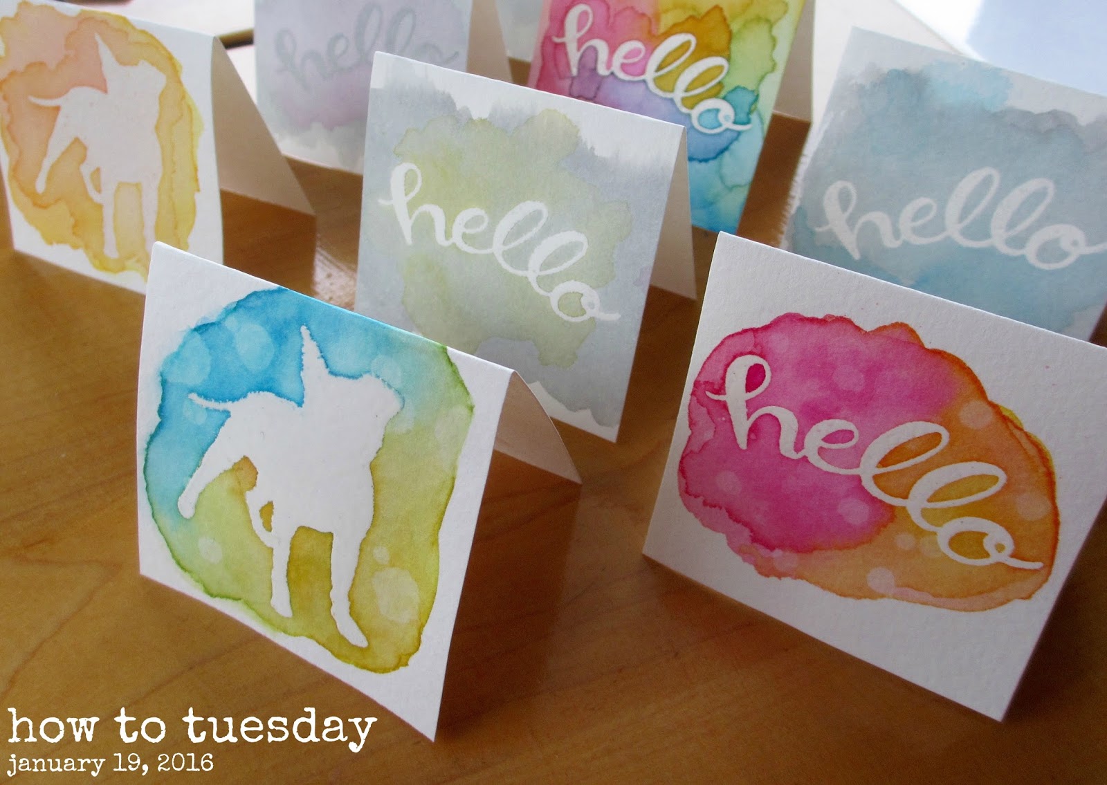
Hello!  I like to practice new techniques on small bits of paper and I think that note cards are a great way to use those finished pieces.  I've recently discovered distress inks and I'm having a lot of fun playing with them and using them along with my rubber stamps.  One technique I'm enjoying is an embossed resist technique, with resist ink as a watercolor paint.  In this "how to" I'll share with you the supplies I have in my personal collection and how I use them.  (I am in no way endorsing any of these products, nor am I suggesting that these are the only brands/types you should use.  Though I do enjoy these products, there are still others I have yet to discover and add to my personal collection.)

Supplies needed:

watercolor paper cut to 2.5" x 5"
white (pigment) or clear (watermark) ink
clear embossing powder
heat tool (or oven)
pencil (optional)
eraser (optional)
distress ink or watercolor paint
brush
water
palette, lid, or laminated card
paper towels
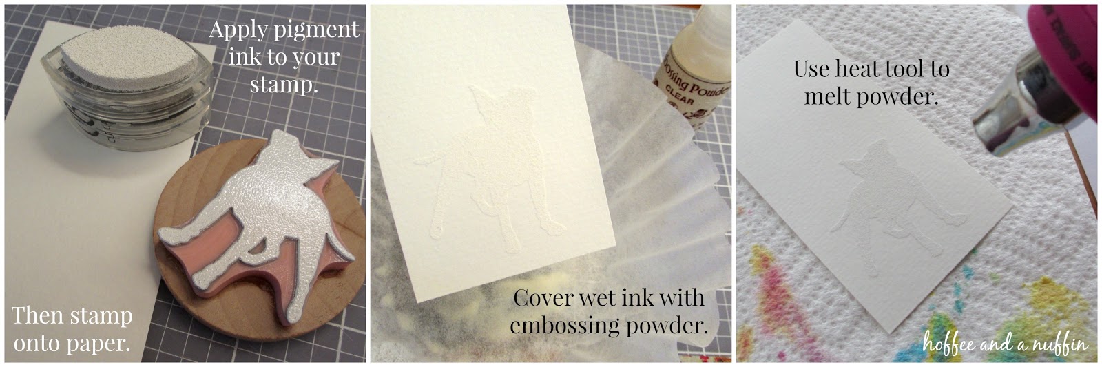
I began by preparing my watercolor paper with the stamped and embossed image.
Once my cards were embossed, I was ready to begin painting.  Distress ink can be pressed directly to a smooth surface to discharge ink.  With a wet brush, we can pick up color and even blend colors on the surface before adding it to the paper.  TIP: If the ink dries on the plastic, simply wet it again to reactivate it.  This is a good way to conserve ink, too.  There's no need to wipe the plastic clean unless the colors become muddy.  It can be used again at a later time.

The melted embossing powder acts as a barrier, resisting ink and paint in the areas of the paper it was applied.  Pretty cool, huh?

1. Color your paper with wet ink.  
2. Allow it to dry.  A heat tool can be used to speed up the drying process.

3. Water droplets can be added to create a "bleached" effect.  Let the drops sit on the paper for several seconds.  (30 seconds?  A minute?  You decide.)
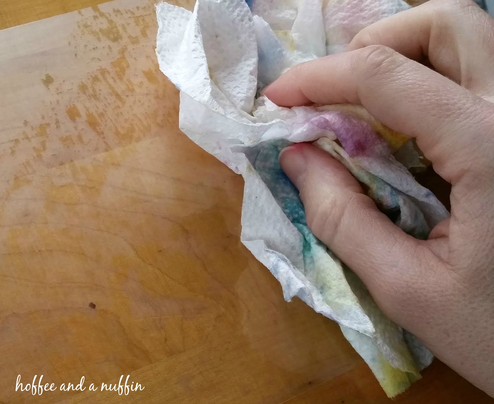
4. Use a paper towel to blot the water droplets and reveal your finished painting.
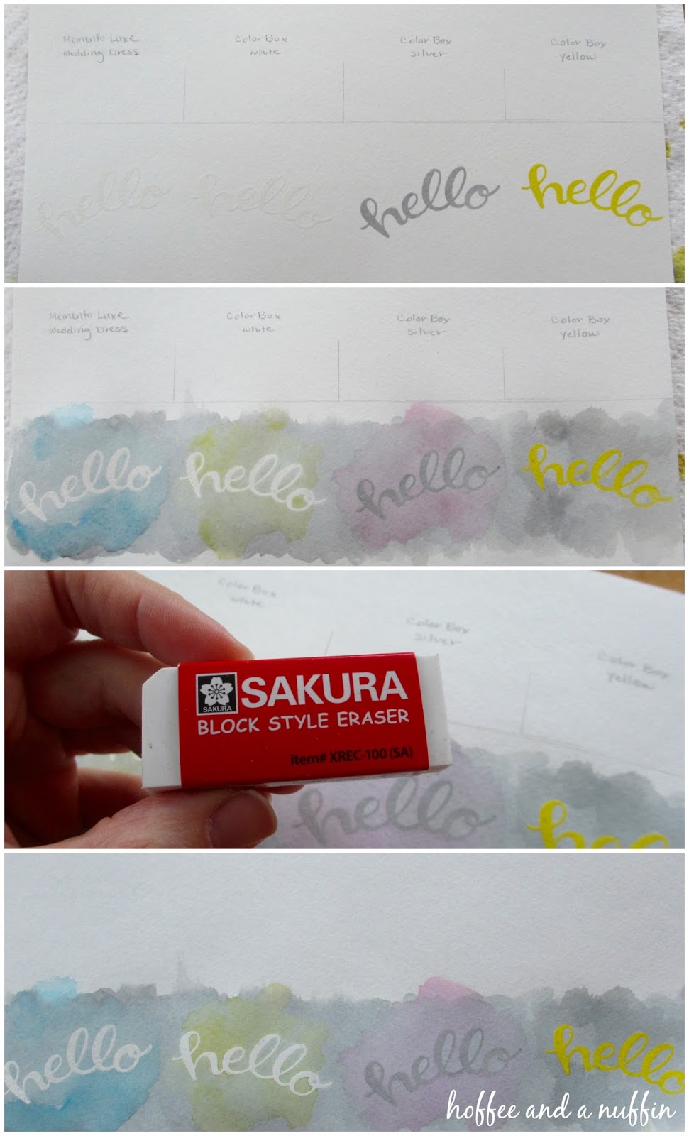
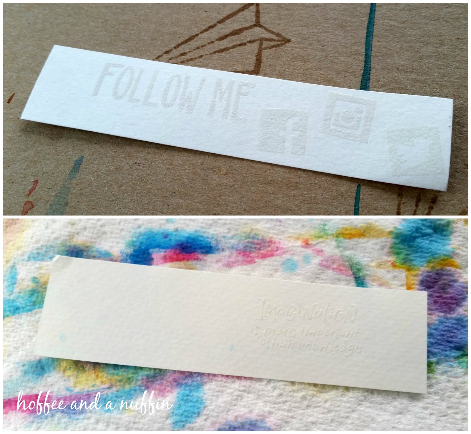
 I wondered if it would have been easier to work on ONE large piece of paper that could be cut down later, so this example was a test for comparison.  I cut this paper down to 10" x 5".  That would give me four cards.  I used a pencil and ruler to very lightly mark lines so I knew where to stamp.  I also wanted to compare different inks while at the same time using the same clear embossing powder.  From left to right the inks are: Memento Luxe, Wedding Dress; ColorBox, White; ColorBox, Silver; and ColorBox, Yellow.  I hadn't used my black distress ink yet, so I thought this test would be a good project to use it for.  I painted black ink across the length of the paper, then layered colored ink over the first three cards, adding extra black ink over the last.  I really like the way they turned out.  It's a different effect, and for our gloomy, rainy skies today it seemed rather appropriate.  Once the ink was dry, I erased all of my lines and cut the cards down to 2.5".

NOTE: My preference for white ink would be the ColorBox pigment ink because it was much more "wet" than the Memento Luxe.  Memento Luxe is GREAT!  But for this project, I think the ColorBox was a better pigment ink.
 Don't forget to go back and erase those lines!  (I do like my Sakura eraser.)
I didn't tape my cards down before painting to keep them flat.  When they were dry I stuck them between the pages of a heavy book and let them sit for a bit.  It works for me.  My cards are informal and handmade.  I think the little irregularities add to their handmade charm.

I hope this demonstration offers some inspiration and I look forward to seeing what you come up with.  As always, thank you for following along on my handmade journey.  Happy crafting!


Thursday, January 7, 2016

TESTING! (Ink)

We've been chatting about types of ink, what to use on tags, and what inks will bleed when wet. Keep in mind that I can only test the inks I actually have in my personal collection.  There are SO many brands and types of ink on the market, and I'll say again: I am NO expert on any of them.  There may be inks that are SO much better than what I've got.  Only, I haven't discovered them yet.  Please do your own research and testing to expand your personal knowledge of the tools you're using.  It's a GOOD thing to do, and you'll craft more confidently with that information in your toolkit.  Find what works for YOU.

The short version of what I know: Dye inks are water based and quick drying.  I use those mostly for casual letters/stationery and envelopes.  Pigment inks are typically wet, slower drying, and great for embossing.  Chalk inks dry pretty quickly and are great for planners and card making.  They're not so great for embossing.


Now I'll share with you what I discovered during my test today.
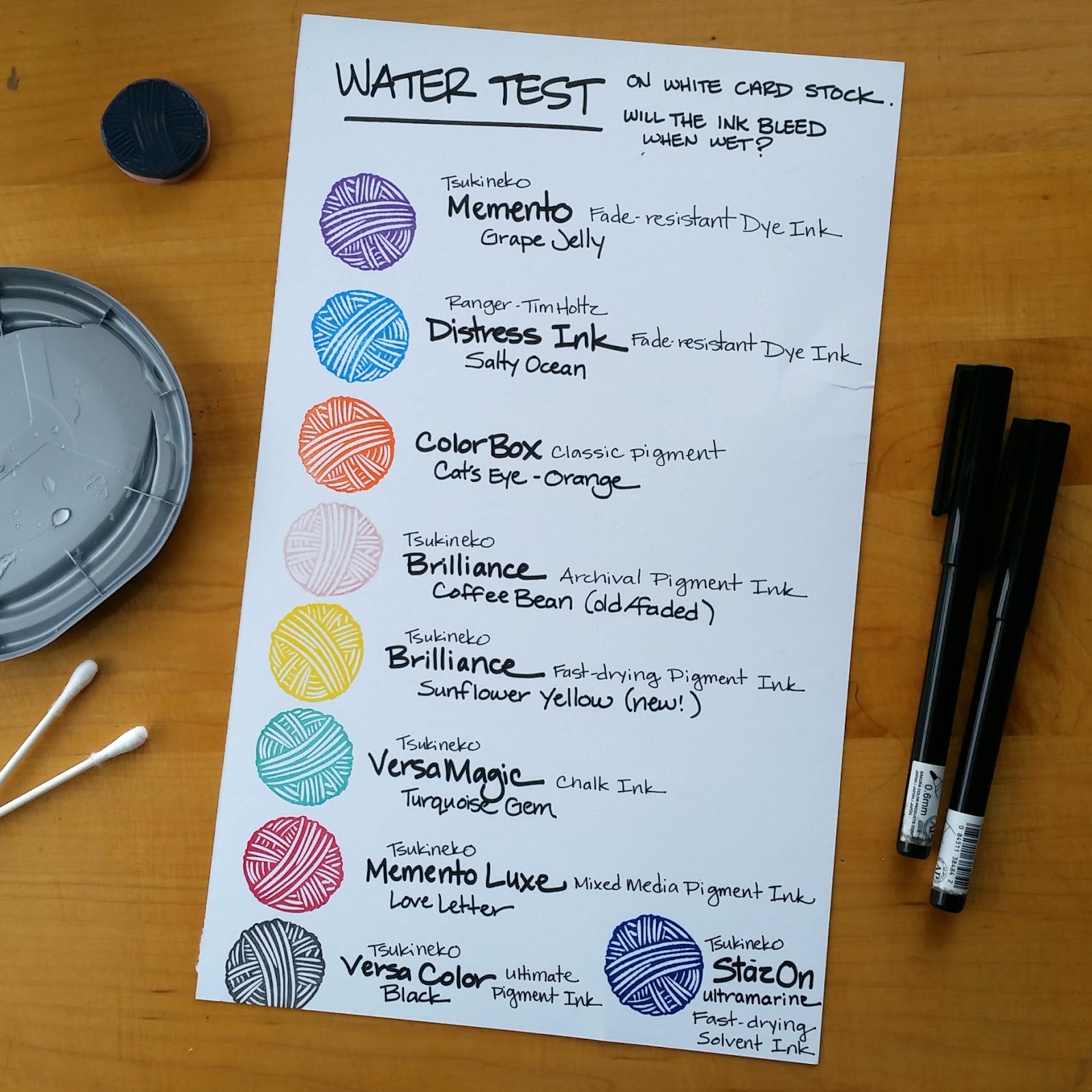
I may have missed a type, but I tried to pull one of every type of ink I have in my craft room.  I stamped a sample onto a piece of smooth card stock and labeled them for reference.
Shortly after creating this sheet, about 10 minutes or so, I used a cotton swab and water to rub the surface of the stamped images.   There was a little bit of color distribution, but notice also that I said that I rubbed the surface of the image.  I wonder if the color would have smeared had I dropped water onto the surface instead.
The only way to really tell was to wait an hour and let those inks dry.   This time I dropped a larger amount of water onto the samples and let it sit.  From what I can tell, those dye based inks (which we knew!) are the worst offenders when considering what types of ink to use for things like tags for handmade items.  I don't know if any of the color would pull up and affect your pieces, but I also wouldn't want to take the chance.  It seems that all of the pigment inks and chalk ink did well after the ink was allowed sufficient time to dry.

I encourage you to DO YOUR OWN TESTING.  Besides, it's kind of fun to explore and experiment!

(Small Ball of Yarn stamp can be purchased in my Etsy shop.)


Tuesday, January 5, 2016

How To Tuesday - Playing With Distress Ink

I've recently discovered playing with watercolors and distress inks against my rubber stamped images.  I am absolutely having fun with the resist technique!  This is not a tutorial per se, but I will share a little bit of what I've been doing here as best I can.

Before we get started, I'd like to remind you that I am not a rubber stamp or scrapbook/card-making expert.  I design stamps.  I carve stamps.  I like to use stamps.  But when it comes to the knowledge of inks, powders, papers, tools, and methods... I'm still learning all of those things, too.  THAT is why this is not a tutorial.  I'm not going to tell you what you should do.  I encourage you to pick up some supplies to explore and discover this medium for yourself.  See what you like.  See what works best for you!

Here are a few tips to help get you started:

For the majority of us, standing in the rubber stamp aisle at the craft store can be extremely overwhelming.  There are 100s of different types of inks and tools staring right back at us.  You pick some up, you put a few back, you grab another color, you debate that color, then put it back...  Where do you begin?  As I was standing looking at the display of Tim Holtz Distress Ink, I decided it would be best to begin with the basics.  That meant I would need a red, yellow, and blue.  From there I could also have orange, green, and purple.  Perfect!  Of course, I wanted them ALL, but that's just not practical.  So, I picked up Picked Raspberry, Wild Honey, and Salty Ocean to begin with.
I bought the little daubers, too.  Those are fun!  I also bought the MISTER bottle by Ranger because it promised to produce a fine mist.  It does!  I'm glad I picked one up.  That was all I bought to get started because I didn't know if I would love it or hate it.  I'm pleased to say that I will eventually be adding more colors to my collection.

The supplies I used for these samples were:

watercolor paper (cut to 5" x 7", and scraps)
white pigment ink
clear embossing powder
heat tool
Tim Holtz Distress Ink
daubers
MISTER bottle
paint brush
laminating plastic (palette)
paper towels
p a t i e n c e
s e n s e   o f   a d v e n t u r e

To begin, I stamped my images with white pigment ink onto watercolor paper.  Then I coated the wet ink with embossing powder and set it with a heat tool.
Then I cut a piece of laminating plastic (I used half of one side) and placed it on my table, smooth side up.  That is what I used for a palette.  I pressed the ink pad directly to the surface of the plastic, then spritzed it with the water bottle to make the ink wet.
From here we could do one of a couple of things.  On one of the book marks, the one that is very light and looks like watercolor, I turned the paper over and pressed it onto the ink.  Then I lifted it, turned it a bit, and pressed it down again.  It's very random.  It's very cool!  If you don't like the way it looks, you could dab your paper with a paper towel to lift the color (there will be residual color) and you could press it again.  Or paint over it.  Or throw it away and start over.  It's not a BIG deal.  Keep trying!
Working with distress inks for the first time.
The other, darker bookmark was created using the daubers.  That was more of a dry application of ink.  I used the daubers to sort of "paint" the color onto the paper.  There is a LOT more control with that method.  When I first started, I tapped the charged dauber onto the paper (dot, dot, dot) then later discovered that I could rub the dauber around to better blend the colors.  Try anything.  See what works for you.
The result of this method would have been different if I had spritzed the paper with the water bottle.  The colors would have played and blended like watercolors.  I decided that I liked the bold color on the paper and chose to add a few droplets of water for interest instead.  The way this ink works is that it is reactivated when you apply water to it.  So... for this bookmark, for example, when I added droplets of water to it and waited for about half a minute, then pressed a dry paper towel to it it lifted the water along with the ink in those spots to create sort of a "bleached" effect on the paper.  It's cool!  Give that a try.

Another thing to try is to paint with the wet ink from the palette with a brush like you would with watercolors.  What's really cool about a stamped, embossed image, is that you can get color to "pool" inside the raised surface, OR, you can use that surface as a barrier to keep color away from an area.
...and keep those paper towels nearby!  You'll use them to clean up little spills and extra sprayed water.  They can also be used to wipe your palette clean between projects.
 

I hope this helps to give a little bit of an idea of what's been going on in my little corner of the world.  I hope you feel inspired to grab a few colors and give it a try.  Be brave.  I don't think you will be disappointed.
(Hibiscus and Social Media hand carved rubber stamps are sold in my Etsy shop.)