Friday, April 29, 2016

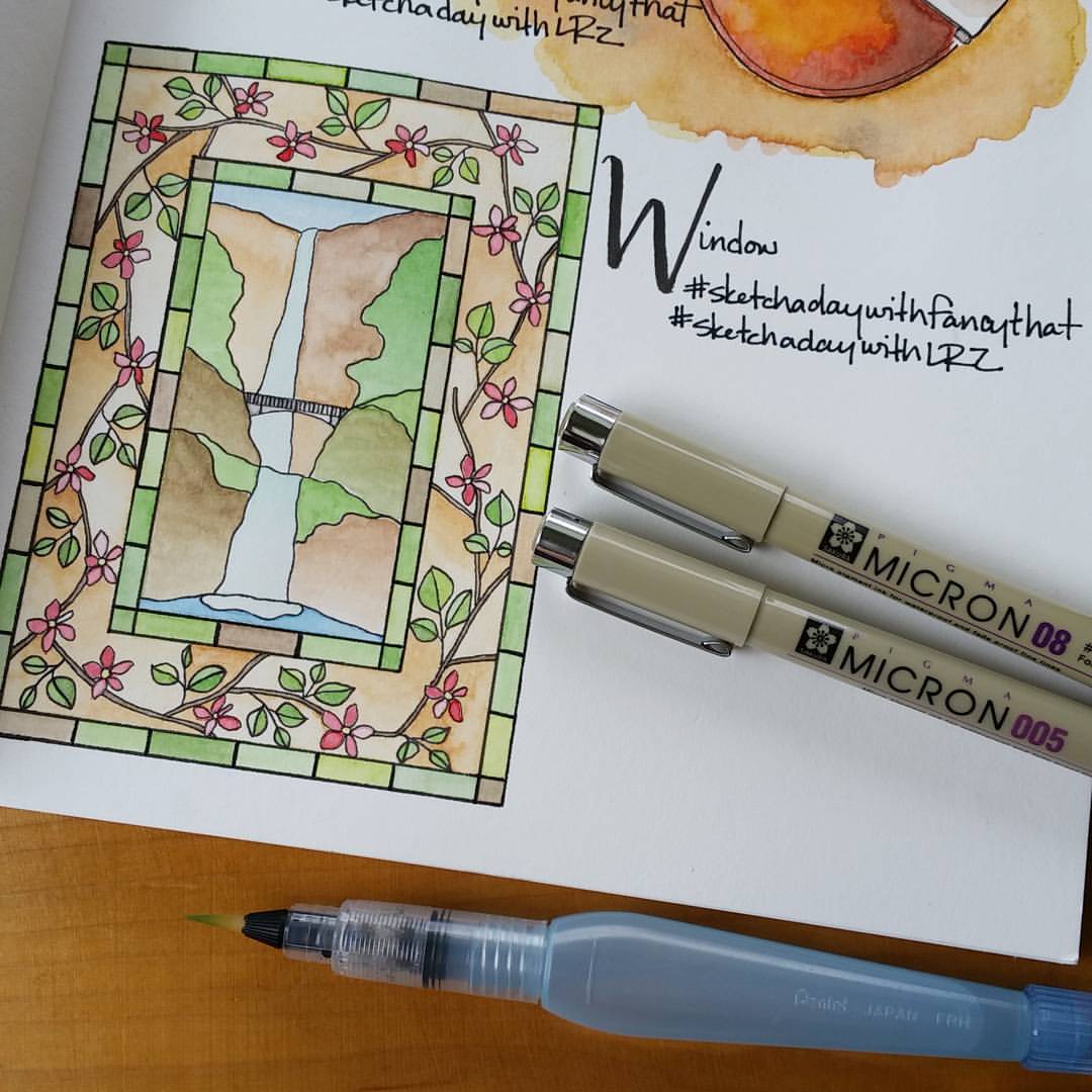
FREE Coloring Page - Multnomah Falls, Oregon

I feel fortunate to live in such a beautiful region.  When I first moved to Oregon, I often found my way out to the Columbia River Gorge and traveled the twisty, winding, Historic Columbia River Highway 30.  I've sat with coffee watching many sunrises at Crown Point.  In recent years, we've spent several weekend days hiking the trails and visiting the many waterfalls that dot that stretch of our gorgeous landscape.  The Columbia River Gorge, to me, truly is a magical place.  


So begins my journey with coloring pages.  I can't think of a better place to start than with the magnificent Multnomah Falls.  It's a beauty to observe from the ground level as a stop along the highway, but it's a whole different thing to hike a mile up the switchbacks to view the Columbia River and north into the state of Washington from the top of the falls.  (Don't stop there.  Your hike on the mountain has only begun.)


This coloring page is FREE for you to print and color at home or in the classroom.  (Illustration is property of R.Goodwin/hoffeeandanuffin and may NOT be used for sale or reproduction.) For educational purposes, have students research and discuss:

Columbia River Gorge
Oregon History
Lewis and Clark
Logging
Benson Footbridge
Salmonberries (and other edible wild fruit)
Hiking and Trails
Hiking Safety

To print this coloring page, click on the image to view the full page, then right-click on the image and "Save Image As" to your computer.  I hope you enjoy coloring Multnomah Falls, Oregon.  I would love to see your colored pages!  Follow me on Facebook and tag #hoffeeandanuffincoloring @hoffeeandanuffin on Instagram.

Tuesday, January 26, 2016

How To Tuesday - Rainbow Tree

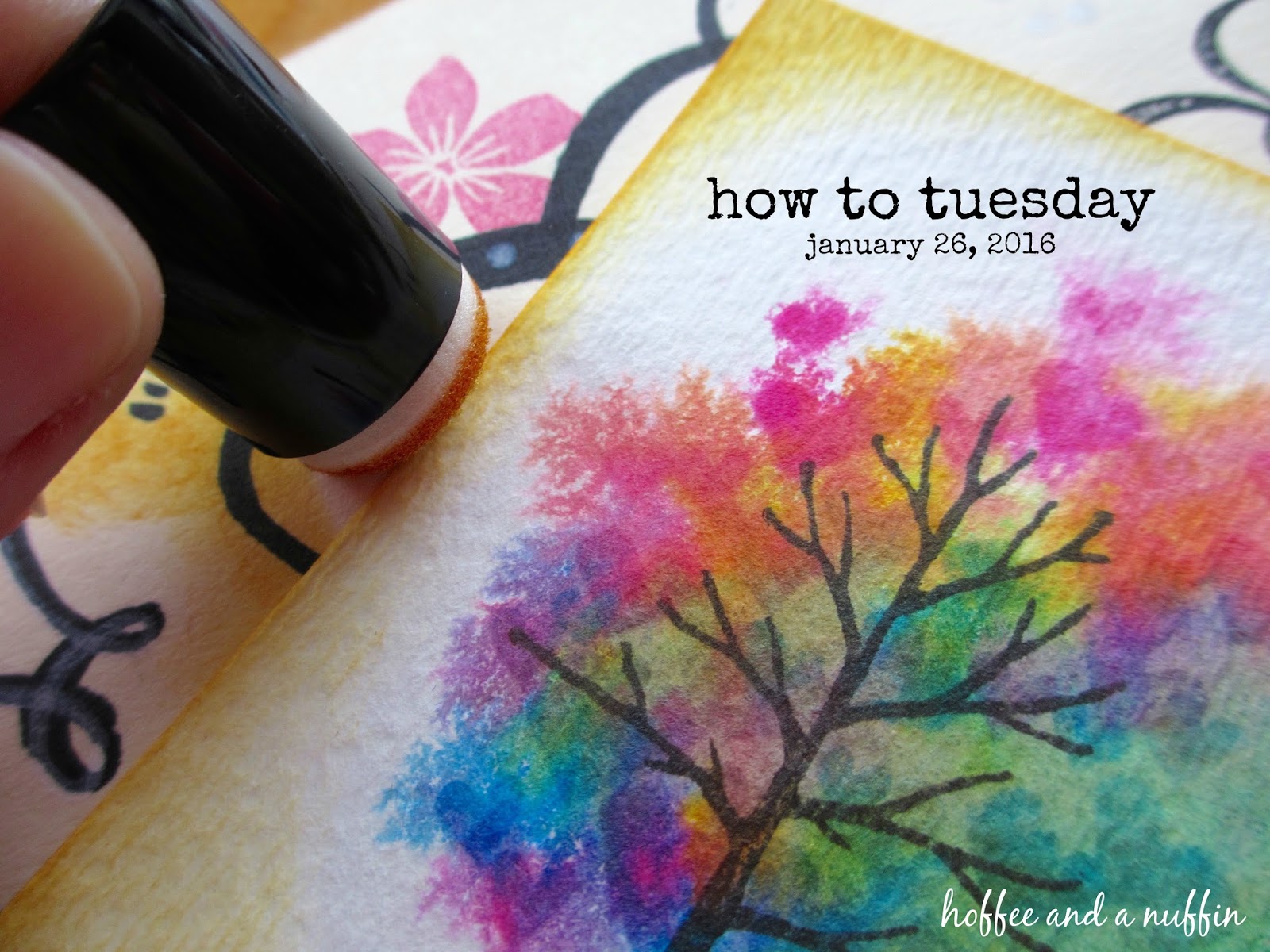
As you know I've recently discovered Tim Holtz Distress Inks and have been experimenting with them and learning how they work.  One of my favorite things to make lately is the Rainbow Tree.  I love layering and blending colors, and this is a fun (beginner/great-for-kids, too!) project to use techniques that allow colors to play with each other.  I also wanted to compare creating trees with distress inks to creating trees with watercolor paints.

What you'll need:
Tree (With Endless Possibilities) Hand Carved Rubber Stamp
Three Tiny Hearts Hand Carved Rubber Stamp
(okay, those stamps are completely optional, but I do recommend them!)
Watercolor Paper
Distress Ink
Water
Watercolor Paintbrush
Paper Towels
A Sense Of Adventure

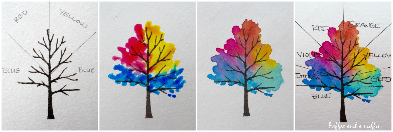
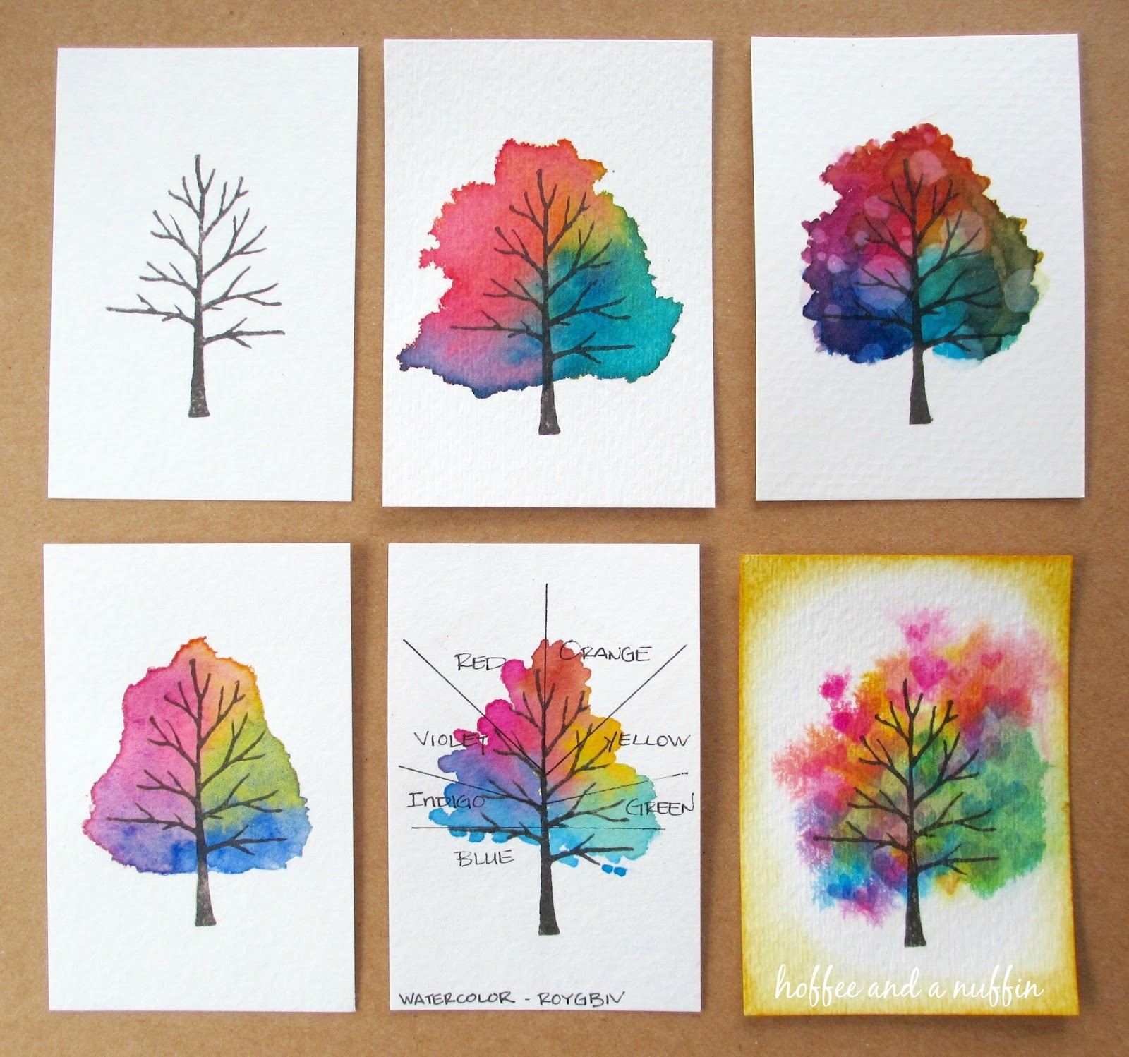
When I was shopping for distress inks, I deliberately purchased only three colors to see if I would even like using them.  I knew that as long as I had "red", "blue", and "yellow", I could create a "rainbow" of colors to use.  This is how the Rainbow Tree came to be.  Take yourself back to elementary school, to a time when you were learning about the rainbow, primary colors, and secondary colors.  This diagram shows the placement of color to create the "rainbow" effect on my tree.  A little bit of water and a few brush strokes between those primary colors blends to create secondary colors, and ultimately the "rainbow".  (I should note that this diagram was actually created with watercolors, NOT distress inks... but you get the point.)
 Here's another example using distress inks.  This time I added a few layers of color to really build up the pigment.  I do love the look of layers of distress ink, especially when water is added to the distress ink after it has dried.  Notice the trees in the center, and center left.  When droplets of water are added to the ink, it "lifts" the ink, and can be blotted away with a dry paper towel, creating a sort of bleached effect.  It almost reminds me of lens flare.  It's really pretty! 
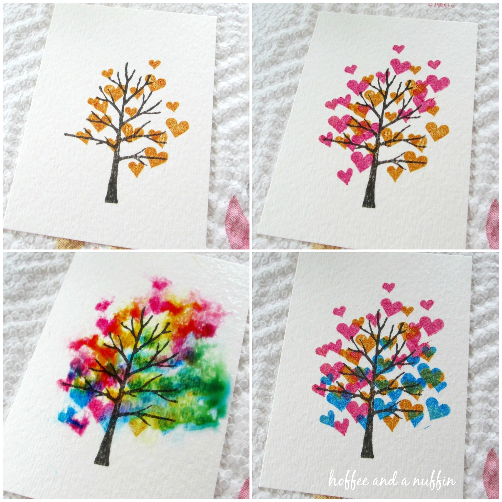
Another option is to add color with another rubber stamp.  In this example, I used my Three Tiny Hearts rubber stamp, but any little stamp can be used.   I first discovered this technique for my tree when I used a pencil eraser to add R, Y, B ink to my tree, then sprayed water on it to activate the ink and get it moving around on the paper.  Later I discovered blowing on the wet ink with a straw to push it out toward the edges of the paper, as if the tree were stretching outward.  That was kind of fun, too.  (Kids will LOVE that!)
Next is a tree I made with watercolor paints.  I have been using the distress inks as watercolor so much that it sort of became a "default" technique for adding wet color to my projects.  (How do you use distress ink at a "wet" color?  See last week's How To Tuesday for that demonstration.)  In my opinion, both techniques work really well and I don't think I prefer one over the other.  They're just different.  I do feel like I had more control and richer pigment with my watercolors.  I love the layering I can achieve with the distress ink, PLUS the advantage of "bleaching" the color with the addition of water.  (That's so much fun!)  They're both great.
Top Row:
  Left - Tree (With Endless Possibilities, small) rubber stamp with Timber Brown StazOn ink.

  Center - distress ink applied as a watercolor
  Right - distress ink applied as a watercolor, "bleached" by adding water and blotting with dry towel

Bottom Row:
  Left - watercolor paint
  Center - diagram of "rainbow" effect

  Right - tree with color stamped with Three Tiny Hearts rubber stamp.

I hope this demonstration offers some inspiration and I look forward to seeing what you come up with.  I'd love to see any trees you (or your kiddos!) make.  Please share them with me on Facebook or Instagram: #hoffeeandanuffin  

As always, thank you for following along on my handmade journey.  Happy crafting!

Tuesday, January 19, 2016

How To Tuesday - Note Cards

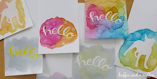
Hello!  I like to practice new techniques on small bits of paper and I think that note cards are a great way to use those finished pieces.  I've recently discovered distress inks and I'm having a lot of fun playing with them and using them along with my rubber stamps.  One technique I'm enjoying is an embossed resist technique, with resist ink as a watercolor paint.  In this "how to" I'll share with you the supplies I have in my personal collection and how I use them.  (I am in no way endorsing any of these products, nor am I suggesting that these are the only brands/types you should use.  Though I do enjoy these products, there are still others I have yet to discover and add to my personal collection.)

Supplies needed:

watercolor paper cut to 2.5" x 5"
white (pigment) or clear (watermark) ink
clear embossing powder
heat tool (or oven)
pencil (optional)
eraser (optional)
distress ink or watercolor paint
brush
water
palette, lid, or laminated card
paper towels
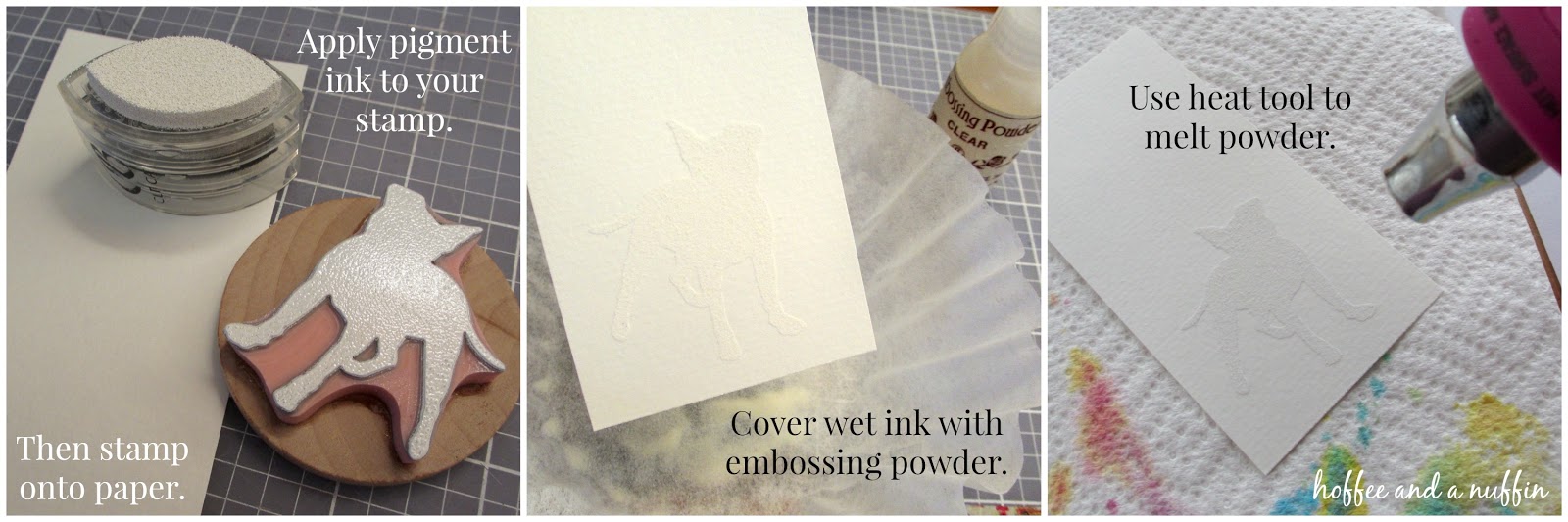
I began by preparing my watercolor paper with the stamped and embossed image.
Once my cards were embossed, I was ready to begin painting.  Distress ink can be pressed directly to a smooth surface to discharge ink.  With a wet brush, we can pick up color and even blend colors on the surface before adding it to the paper.  TIP: If the ink dries on the plastic, simply wet it again to reactivate it.  This is a good way to conserve ink, too.  There's no need to wipe the plastic clean unless the colors become muddy.  It can be used again at a later time.

The melted embossing powder acts as a barrier, resisting ink and paint in the areas of the paper it was applied.  Pretty cool, huh?
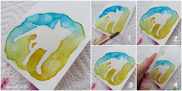
1. Color your paper with wet ink.  
2. Allow it to dry.  A heat tool can be used to speed up the drying process.

3. Water droplets can be added to create a "bleached" effect.  Let the drops sit on the paper for several seconds.  (30 seconds?  A minute?  You decide.)
4. Use a paper towel to blot the water droplets and reveal your finished painting.
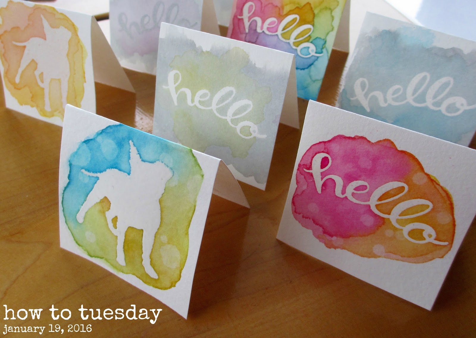
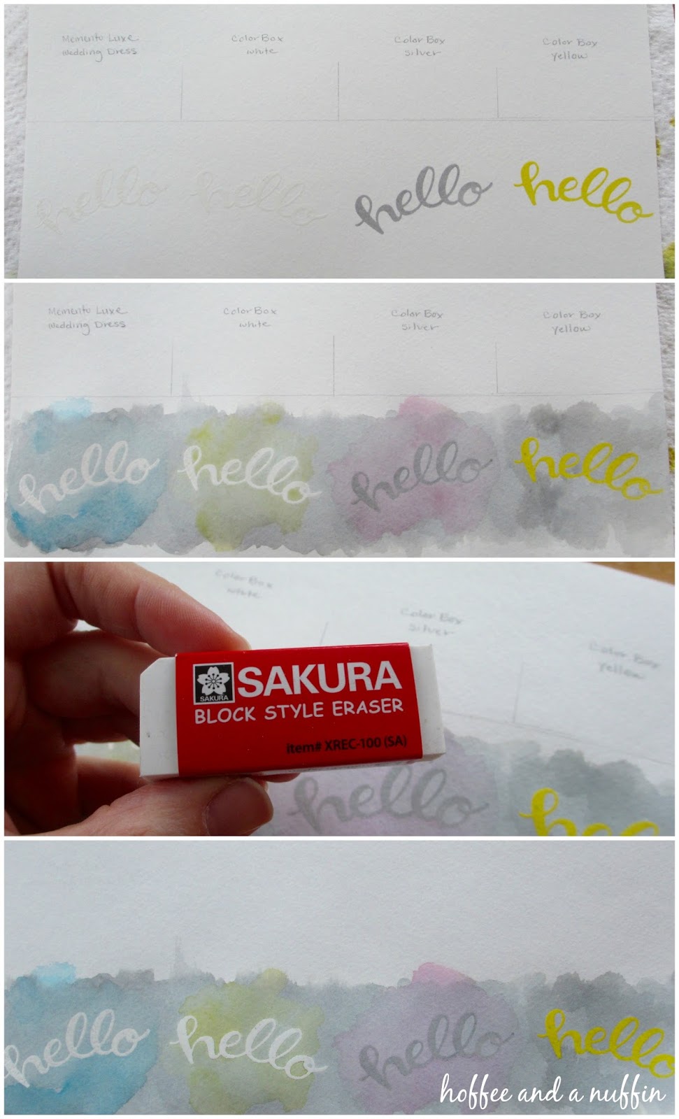
 I wondered if it would have been easier to work on ONE large piece of paper that could be cut down later, so this example was a test for comparison.  I cut this paper down to 10" x 5".  That would give me four cards.  I used a pencil and ruler to very lightly mark lines so I knew where to stamp.  I also wanted to compare different inks while at the same time using the same clear embossing powder.  From left to right the inks are: Memento Luxe, Wedding Dress; ColorBox, White; ColorBox, Silver; and ColorBox, Yellow.  I hadn't used my black distress ink yet, so I thought this test would be a good project to use it for.  I painted black ink across the length of the paper, then layered colored ink over the first three cards, adding extra black ink over the last.  I really like the way they turned out.  It's a different effect, and for our gloomy, rainy skies today it seemed rather appropriate.  Once the ink was dry, I erased all of my lines and cut the cards down to 2.5".

NOTE: My preference for white ink would be the ColorBox pigment ink because it was much more "wet" than the Memento Luxe.  Memento Luxe is GREAT!  But for this project, I think the ColorBox was a better pigment ink.
 Don't forget to go back and erase those lines!  (I do like my Sakura eraser.)
I didn't tape my cards down before painting to keep them flat.  When they were dry I stuck them between the pages of a heavy book and let them sit for a bit.  It works for me.  My cards are informal and handmade.  I think the little irregularities add to their handmade charm.

I hope this demonstration offers some inspiration and I look forward to seeing what you come up with.  As always, thank you for following along on my handmade journey.  Happy crafting!